Quick brief: Design a logo for Smile an outdoor clothing range company for hikers/ climbers.
As hiking boots are vital to the activity I looked at designing the name around something to do with the shoes, and after a while of messing around with drawing boots. I decided incorporating the name into the tread would work well on the boots and on a label.
The spacing of the tread needs some work, but as a quick design I think the idea works well.
"Rules are what the artist breaks; the memorable never emerged from a formula." - Bill Bernbach began a creative revolution changing the face of the advertising and graphics industry. The 50s and 60s were dominated by consumer culture, possessions were more important than anything else. After the Wall Street Crash of 1929 and the subsequent Depression, America was constantly stimulated to buy, conditioned to appreciate the joy of material things. This created a consumerist society, form followed function, form drives the desire to buy. A classic example of this is the Nash advert.
Visual Language, and Design and Composition
The advert claims that only true happiness comes from ownership of this car. With this car you can be the top of your class, show off infront of your neighbours. Buy Big.
You can't get better, its the newest so its got to be the best..right? So new no-one will have it...yet.
The holiday your going on won't be as good or as flash as this car, this drive will be the best part about it. But what a con because its not necessarily going to be the most comfortable or safest or best journey you could make but you show off while your doing it.
All of these adverts use all the space, bright colours and clutter the page with this american dream lifestyle endorsing a disposable society. Our enormously productive economy demands that we make consumption our way of life that we convert buying and use of goods into a ritual.
Bill Bernbach was sick of this narcissistic industry that is supposed to be about creation, but instead cons people and slowly begins to turn them against advertising all together. Paul Rand and Bernbach joined forced starting their own company with the first art director to copywriter equal collaboration. DDB created graphics that dealt with real life, what they were going through, not having all this money you were supposed to have. DDB empathised with their audience, and this is how they changed everything.
Audience and Context
The Volkswagen Beatle was actually designed by Hitler, and in 1959 DDB were brought in to advertise it. DDB began in New York a predominantly Jewish City, so how do you sell a Nazi car to Jews? By recognising who the audience was and respecting them. Instead of bullshitting, just telling the truth.
Yes it was designed by Hitler, but its actually a pretty decent car.
The photograph is of one of the cars from the production line that didn't make it, due to a imperfection on one of the doors. Lemon an insult in america was thus used to describe it, it was useless - a lemon. The advert was a double entendre, open, honest and funny. The first ad of its kind.
Visual Language, and Design and Composition
Many more ads of this original style were then created
This style is still rarely used today, as clients hate to pay for space that isn't being used. But how much more effective is this. By placing the product at a distance on a sea of white space, it encourages you to focus on the car, there is nothing else to distract you. The car is small, its not flashy, but why not.
Less is more.
Also due the era this advert was fairly controversial, going against everything every other company has been trying to tell you...think big. DDB recognised the american dream didn't really exist and not everyone can afford the luxuries that they were supposed to have. Why not think small.
In 20 years the car barely changes, no need for adjustment or alteration like all the fancy cars that come out. This is perfect as it is.
Making a comment on 50s society, if you're trying to impress by having a big car, big house ect but maybe can't afford it. Get the Beatle it will at least make your house look like its bigger.
Creative Thinking
By looking at the context of the time in which we are designing for we can understand the needs of our audience and create something which has a direct appeal.
Cadburys' - Gorilla - "A glass and a half full of joy."
At the beginning of 2007 sales of cadbury's chocolate plummeted as their unhygienic method of storage caused a contamination in their chocolate, causing an outbreak of salmonella. Cadbury's needed something new to get their name back out there amongst trusted products. People remember eating Cadburys chocolate when they were younger, and have fond associations of these memories, so ad agency Fallon were briefed to "Bring back the joy". Juan Cabral using the style of classic DDB did this in the direction of the now legendary commercials.
This style of advertising is so effective it doesn't ram information down your throat or force you to accept a brand. Fallon with Cadburys like DDB create humour and entertainment. Memorable advertising, make the audience think and appreciate the idea, and the function of the product your selling. (DDB Volkswagen Beatle advert -
"How does the man who drives the snowplow get to the snowplow?" )
Bernbach is a design hero, he took graphics by the scruff of the neck and brought it back to what it should be, creative, fun, unique, and not solely about affluence. In relation to my work or any other graphic designer, understanding your audience is key. Always create something thats memorable. "Think Different".
A closer look into the styles and inspiration of Parisian artist So-ME, art director of Ed-Banger Records.
There is a huge overlay between fine art and graphic design, the two often merge together; by one inspiring the other, development of an artist, development of art culture. For example Bar at the Folies Bergere, by Manet, demonstrates how commercialism and therefore graphics was being introduced to fine art.
Notice how branding has creeped into this detailed painting? The champagne bottles on the side.
This then continued to develop into the art movement known as pop-art, which emerged late 50s. With famous artists such as Andy Warhol, Roy Litchenstein.
Pop-art a descendant of Dadaism (another art-movement in which the artists aim was to destroy traditional values of art, but we won't talk about that in detail now.) mocked and parodied traditonal work incorporating elements of mass/ popular culture, such as comics, and everyday items like Campbells soup.
Audience and Context
The popular culture however in contemporary art has transferred over to music. Peter Saville - Unknown Pleasures -Joy Division, Hipgnosis and George Hardie - Dark Side of the Moon - Pink Floyd. Graphic design began to take over music, with the minimalistic style becoming a distinguishing element, it was not understood that designs could be expanded to suit whatever medium and not just be used as a pretty image to sell records. As technology expanded and music videos took over graphics became as much apart of album covers, or music videos as the music itself.
Moving from design on lp's to motion graphics to incorporating that into music videos. So-Me's art direction for Justice D.A.N.C.E utilising motion to create the illusion t-shirt designs are forming a narrative creating from itself. The incredible video goes through hundreds of t-shirts parodying the style of the noughties with the music from the past, michael jackson, pink floyd, the bugles, t-rex amongst others which is perhaps a comment on contemporary culture, that we are merely re appropriating the old and cutting it with the new. Our generation is in a state of limbo between the music of our parents, grandparents, and the music we grew up with now mixed up into some super genre...The sampling generation.
Musical artist Mr Flash (part of Ed Banger Records) is branded by SO-ME as a contrasting musician mixing metal and rock, with 80's synth two extremes, which by mashing together forms an abstraction, creates something unique and interesting. Notice the bright colours used which connote this 80s pop genre contrasting against the dark greasy haired metal head facial silhouette. This visual language is repeated in many of SO-ME and Mr Flash's work, constantly communicating this concept of re-appropriation.
Nike for their 25th anniversary branched out from sports to popular music , using Busy P as a commercial tool. Of course Nike is a huge brand and has no problem making sales but like every company are always looking to boost those sales, and how better than to use the fashion style of rnb and trainers and manipulate that to talk to the fans of Busy P. The majority of consumer products these days are sold via our favourite celebrity, just so we can be that much closer to the utopian world of celebrities. Nike is one of the many examples of commercial crossover or collaboration.
SO-Me has become one of the most successful contemporary designers, grabbing the attention of superstars like Kanye West, who from MTV music awards thought he was the best music could get, but got knocked to reality when he recognised this huge sampling culture he could be apart of. SO-ME seems to have single handedly created this DIY society and brought the world along with him. Virgin Media's - UK TV campaign by Rapier buying into SO-ME's style using kinetic typography, other forms of motion graphics.
So if we've gone from Fine-art to Dadaism to Pop art to Re appropriation, what comes next.
Consider how it will be distributed, the user experience, and how to optimise that experience for the particular platform.
Initiatives created for the coffee chain, to help them to go digital:
Digital Loyalty card
Coffee of the Day Menu (similar to Sub of the Day)
Find us (nearest coffee store)
Compare (compare to other leading coffee chains)
For this brief I Chose to use a smart phone application as my platform for digital launch. As this allows mobility for the initiatives i am introducing.
I then decided this was too boxy and boring, and changed my design to this:
This design gave the type more shape, and the texture was a cutout from a coffee cardboard holder which was kind of accidental but gave the image personality to an otherwise bland design. The light tones of the cup holder contrasts against the original dark mahogany brown.
The hand written type here is far from perfect, with some letters tilting forwards, backwards or bolt upright. Also the spacing between the letters needs to be adjusted so its equal. However as it was a quick brief I didn't really have time to alter the flaws of the design. I will keep it as it is and learn from my mistakes for next time.
Started working on a loyalty card, however realised i needed some form of logo for the company to use as a stamp.
- This was too detailed, the design wouldn't be legible as the size of a stamp on a smart phone screen and instead used a coffee bean.
Then i wanted to learn how to make the buttons of my application look real so i followed an online tutorial, and this is what i got.
Notice the shadows and glass effect as if is on a screen. Very simple to make as well.
I then incorporated all the buttons into each screen of the application
A Brief History of Production During 15th century Europe, the production of books was inefficient and expensive, each book was individually scribed and this took months, as well as preparing sheepskin for parchment.
without paper typogrpahy would not have been possible. By 1276 papermaking had travelled from china to europe , the first paper mill establishes in fabriano, Italy.
Relief printing was the first form of production. Both illustrations and type had to be cut into the same block of wood. It was not possible to create detailed images of lengthy texts from the wood. Due to the possiblity of mass produced paper it became necessary for a more efficient form of printing. Laurens Janszoon Coster manufactured type by carving single letters onto blocks of wood. However The first book in Europe to ever be printed was the Bible by Johannes Gutenberg on September 30th, 1452 using metal movable type.
This invention extends far beyond religion, it is a landmark in time of print production. The Bible highly resembles manuscript due to the marginal spacing, the majority of the pages have 42 lines and has thus produced the nickname of the 42-line Bible. "For a typeface Gutenberg selected the popular textura lettering style"(ref 1), each letter was engraved on metal. The metal had to be soft enough to mould and yet hard enough to be durable consequently the metal was part lead, part tin, and part antimony. Typography revolutionised modern book printing, and the "development of art, science and religion through text."(ref 2) For example the distribution of the bible would allow people to make their own judgements of religion without having to trust the word of a religious figure. It would also help to distribute human rights.
Cees W.de Jong., Alston W. Purvis., eds., 2010, Type: A Visual History of Typefaces and Graphics Styles 1901-1938, Volume 2, China, Taschen
The Experts Who is your favourite expert ?
"Everything is made -Bob and Roberta Smith"
To be honest to select one expert to be my favourite would be extremely difficult, as every artist has something unique about their work that makes them brilliant. Also to say that my favourite expert is a graphic artist would probably be a lie. Many designers I think are amazing but it's not often I find myself inspired to create work. In my opinion you gain more inspiration from fine artists or any other art specification, as they are producing something completely different and you can take it, transform it, spin it on its head, but it will never be the same as its not from the same practise. To produce a piece of work from other designers could very possibly produce another piece of work thats very similar and who wants to do create something already made. However I will explain why Bob and Roberta Smith, and Mike Nelson are two of my favourite artists.
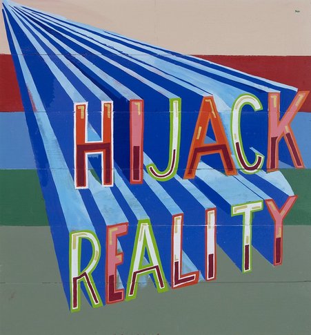
BOB AND ROBERTA SMITH Bob and Roberta Smith create large personalised signs, some of which are similar to something you would expect to see as a status update on social network sites; "Buy me a nice scarf" or "I like Miami". Smith creates works that are almost political but with an edge of humour. He challenges pre-concieved ideas, and the rigidity of education you are made to trust. Smith believes its far better to be absurd, daring. He questions the norm and then pushes it further, using subversive humour to humiliate the constricts of society and authority.
I love this sign, it sums up his style, humorous, controversial, and imaginative. These signs seize your attention, the use of bold colours and three dimensional type, as if the words are about to spring off the page. They literally hijack you from reality, allowing you to forget your surroundings, and be momentarily amused. The use of the word hijack generally associated with tales of war, terrorism and other horribly depressing things, but instead used in conjunction with your imagination. Instead commanding our attention instructing us to go do something absurd, unordinary, anything as long as its not what would be expected in the dull reality of society.
MIKE NELSON
Mike Nelson however is a completely different artist, he is a british contemporary installation artist. I recently saw his work "The Coral Reef" at the Tate in London. Originally built in 1999 and first shown at Matts Gallery London in January 2000. Almost exactly 10 years later shown at the Tate. "The name refers to the oceans surface a prevalent ideology, like one of capitalism. Under the oceans surface lies the coral reef - a complex and fragile structure in which different belief systems exist."
The installation is built as a labyrinth, each room within the exhibition demonstrates its own unique ideology, its own atmosphere. However the labyrinth illustrates a dystopia, a series of fragile societies characterised by human misery and oppression. They are the coral reef, beautiful and interesting each entirely unique, but aren't acknowledged, they can't be seen.
The purpose of the labyrinth portrays this point further as you wander the installation you become lost, a room leads to another room, which leads to another room thats similar. One of the first rooms you enter is later replicated as the last room, making you believe you have gone back on yourself, a guard is ready to escort you out at any moment. I saw this is as very metaphorical, we are lost in these ideologies, they are very prevalent in our lives yet we refuse to accept them but Mike Nelson forces us to become lost within them.