Reflecting upon my background as an artist so far, and where I would like to be headed toward in the future. With a case study on the work of Jonathan Barnbrook. Also briefly showcasing the works of Martin Creed.
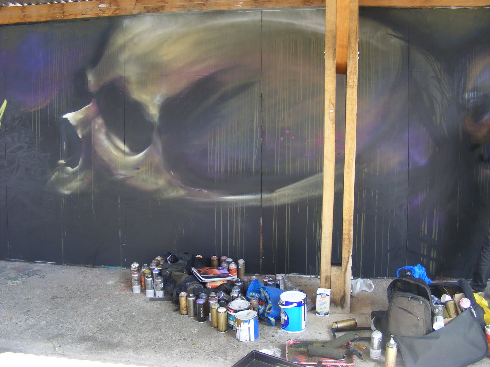
Kinetic Typography, the technical term for 'moving text'. This is something I've been recently learning on Adobe After Effects. What I thought may be fairly easy to learn is proving to be very difficult. My inspiration for such a project has come from watching typographic animation by Sebastian Jaramillo, and Matt Rodgers of Rodgers Creations.
This video is quite simplistic in its idea; matching the words to the timing of Stephen Fry's commentary. The camera follows the words being arranged into each shape which is fully comprehensible later, but the angle or the orientation of the camera rarely changes.
Therefore the video is 2D and less complicated in the sense that by changing camera orientation you create negative angles to observe motion. Type should correspond to the angle of the camera, if you change the angle then any previous work either has to be out of shot or correspond in some aesthetically pleasing way to the new angle.
The Chemical Burn video appears 2D except the letters appear to be floating off the background, this could be due to the way in which the video has been produced, the choice of background or the style of type i'm not sure. The floating effect is used to layer words, so the 'Z rotation' of each text layer is pushed further back behind text or pulled forward in front depending upon the visual importance of the word.
For example text isn't necessarily arranged left to right top to bottom as it would normally be read. Alongside audio this format is redundant. Our brains follow the words as they appear on screen and read them as one sentence, aided by the audio commentary which provides a tone of voice and a pace of which to interpret the meaning or purpose of the animation.
Key Points I have learnt from my first attempt at creating typographic motion animation:
Always keep your letters in capitals or lower case, as continuity of this is vital.
By changing this particular element, the animation look messy and disproportionate. Capitals does always seem to look better, i realise my own work is own lower case but i thought it worked better and by the time i decided capitals would work easily well it was too late.
This does not restrict you to the same type style throughout, as shown above this aids in changing the tone of voice or visual hierarchy of the word.
If you wish to animate text rather than just making it appear in a timed order, each layer needs to be 3D.
Try and keep the 3rd position value constant between each layer, this will make it a lot easier when introducing camera angles.
Introduce audio first before any animation as this will provide a constant timing throughout the video. No matter how similar you think the timing is, text or any layer can quite easily change from a steady pace to frantic appearance. If this is what you want to achieve for specific projects then fine, however if the audio does not change pace then neither should your animation.
Render your video frequently to help you notice any problems as early as possible.
An action-oriented conceptual artist who self categorized himself as an anarchitect – experiments with the removal and relocation of parts of abandoned buildings, his work occupies the space between fine artist and architecture. The concept is similar to deconstructivism; a postmodern movement within architecture. Deconstructivism arouses a notion of structural manipulation into limitless non-rectilinear shapes. It is a maverick amongst society, unsympathetic to the logical, conformist practise of architecture.
1
Gordon Matta-Clark was born in New York City raised by his mother American artist Anne Clark. His father Chilean Surrealist painter Roberto Matta Echaurren who abandoned the family shortly after the birth, maintaining an intermittent relationship allowing Clark to grow up in the social environment of his parents creative associates. Roberto Matta Echaurren studied architecture and worked for Le Corbusier in Paris. Le Corbusier or Charles-Édouard Jeanneret the founder of modern architecture "was a pioneer in studies of modern high design and was dedicated to providing better living conditions for the residents of crowded cities."1 GMC like his father also studied architecture, enrolling in 1962 at Cornell University an establishment recognised for its strong Corbusian influence. In 1968, Matta-Clark relocated to Paris to study French literature at the Sorbonne. There, he witnessed the revolts of May 1968, the event of enormous political and social significance in contemporary history that left a lasting impression on the young artist. It was in Paris where Matta-Clark became aware of the philosophical movement of Deconstructivism, with its innovative concept of détournement” 2- “the re-use well known media to create new work with a different message often opposed to the original.” 3
Gordon Matta Clark produced a series of works known as 'Bronx Floors' in which he dissected the floors and walls of abandoned buildings. By fragmenting integral parts of a structure it allows us to anatomise the living standards, and urban decay of New Yorks boroughs. The physical implication of this process "is a reaction to an ever less viable state of privacy, private property."4 Properties, especially in run down areas such as the Bronx are plagued by crime, which only further devalues the social condition of the area. However this is purposeful, as the longer it is left to deteriorate the quicker the point of no return is reached. Only then society will step in to redevelop these enclosures into the retail park they desire to further boost a greedy economy. Anarchitecture is more complex than offering an alternative attitude to functional space, its delves into the metaphoric gap of the undeveloped spaces "The interest or value wasn't in their possible use...on a functional level that was so absurd as to ridicule the idea of function"5
2
Bronx Floors
'Splitting' One of Gordon Matta Clarks most famous works in which he bought a house in Englewood, New Jersey and stripped it of its contents until it became an empty shell. A one foot incision was made into the roof of the house continued down to the foundations, splitting exactly in half, appearing as though the house was sat on a fault line. Each half fell back on itself slightly to show an opening through the centre. From the side, the house looked entirely normal, it was only when you moved round that the fault line appeared. Clark was predominantly interested in sculptural aspects of stratification, how the surface began to break into numerous layers and in such "reveals the auto-biographical process of its making."6 As a consequence of this deconstructionist process a variety of new surfaces were exhibited, generating unique views.
3
4
5
The powerful commentary of his works lies in the act of the deconstruction, the process is more important than the void left behind, which could be interpreted as destructive and violent rebellion, and not a justified contempt toward contemporary culture. The process of dissection acts as performance art, within an urban jungle. In the same way pedestrians ponder the purpose of a construction site "the openings stop the viewer with their careful revealings."7 Normal structures look at the overall design, the beauty of the finished product. GMC analyses the development of the original structure in relation to purpose, era. The reverse of a finished product, opening an enclosure up to the world for scrutiny, unveiling elements of space in a world of rectilinear shapes, "a poetic critique of architecture and urban space." 8
Gordon Matta Clark encompasses a wide range of artistic and cultural movements; Deconstructivism, Postmodernism, Formalism and to an extent Dadaism. In that his work is a rejection of an oppressive society, the failed ideas of modernist architecture and the formalism movement, which greatly occupied 1960s America. He is the “antidote to the cool abstraction of bureaucrats and intellectuals”. 9
Dereliction of Beauty, pg 60, Vanity Fair, January 2011, no 605, Graydon Carter. ed. Annie Holcroft. Pub - (Ref 2,3,9)
Book
Barbican Centre, 2011, Laurie Anderson Trisha Brown Gordon Matta Clark Pioneers of the Downtown Scene New York 1970s, Curated by Lydia Yee, London, Prestel
Ever since I can remember, whenever I've walked up to a shelve of books the Penguin publishing brand instinctively and unconsciously stands out to me. I've always dismissed this notion of how a Penguin book is always appearing in my hand until, I had to think who was my design hero. We are told to never judge a book by its cover, as bad design doesn't necessarily mean a bad story. The history of Penguin publishing explains the difficulty of book design in an increasingly competitive market; to create a strong brand identity, and still appeal to a mass market by use of thrilling visuals.
(Penguin logo)Ref1
Penguin was established in 1935 by Allen Lane, the managing director of limited edition book publishers The Bodley Head. The idea was to reprint fiction and non fiction titles in an attractive paperback edition, capitalising on what other publishers didn't seem to feel was important; accessible, well presented, cheap pocket editions. After ten years the word paperback and Penguin became synonymous.
In march 1947 Jan Tschichold took over in production and typography of publications, the printers were re-educated in the importance of consistency with composition rules of which to structure the work. Before his arrival type was not being correctly letter spaced leaving awkward holes. Type looked standard and ordinary as all the features of which were left up to the individual printers.
Tschichold did little to the main elements of the horizontal design but instead tweaked certain aspects, for example; Bodoni extra bold replaced Gill Sans. Thanks to his refinements the three paneled design provided strong visual language, there was a definitive clarity between author, title, and publisher through use of two type weights and a bolder typographic style consequently creating a benchmark achieved by no other publishing company.
(Left - Initial cover - Edward Young.
Right - Shows Tschichold's refinements to the cover design.)Ref2
However by the 1950's Penguin had over 700 titles in print all with a relatively similar cover design, which had become very hard to differentiate. Competitors were also manufacturing more modern approaches, leaving the horizontal grid looking boring and unimaginative by comparison.
Hans Schmoller had an idea to change the horizontal grid to vertical to modernise cover design, allowing a continuation of brand identity but a new overall visual. For the first time different typefaces were introduced for certain authors to provide author identity. Despite the change, there was a restriction of whether to intrude on the coloured borders and thus impose upon the brand, this led to clumsy composition and therefore an off-putting visual language. Although it is evident how designers are trying to progress to a more contemporary approach in my opinion the intrusive artwork and various types appear to just sit on top of the vertical grid. As further progression was made, photographs became introduced and the graduating tones allows the image to blend in, which is more visually pleasing.
The horizontal and vertical grids allowed for a strong brand identity but displayed little variation and were very restrictive in regards to space, colour and typography. Originally these early examples were very fresh and distinctive but as time wore on they became a plain sea of orange and white titles, their presence formed a background to the unattractive yet bolder designs of their competition. The 60s 'represented change' for the company, drastic editorial adjustments needed to be made to keep up with the interests of modern society.
Clear acknowledgement of audience is then demonstrated within each sub series, each composition targeting a specific audience. For example the Education series of 1971 displays large bold black type set on a white background which allows visual ease when selecting a title. Even the spine is instantaneously recognisable the audience can see what they're looking for without wasting time picking up the wrong book. This bold typographic style is repeated on the front, often highlighted and complimented through use of humorous illustrations. The daunting topic of education is therefore made bearable and approachable to students, which successfully addresses their audience.
(Education series)Ref3
Penguin have always concentrated on sensitivity of design in relation to content, which spoke for the quality of its publishing setting the highest possible standard. However "the financial uncertainties of the early 1970s brought the inevitable shift away from the intrinsic value of books themselves towards the profit orientated nature of modern publishing."Ref4 Commercial pressure meant book covers became tie-ins to film and television series, promoting across both media platforms as a creative strategy to transfer the financial success of popular culture. The earliest example of a tie-in is the 1953 publication of the Quatermass Experiment, a BBC television series about the British Space programme. The book combines the classic tripartite style, with an illustrated imitation of the programmes opening credits, linking the two mediums. The covers were no way near as clever or visually simulating but the public are attracted to the familiar and thus will buy into fads or franchises in order to be seen as fashionable.
(TV credits)Ref5
(Cover tie-in)Ref6
The original cover design of the tripartite or horizontal grid is still found on a few books today. Coloured upper and lower sections categorise genres, concealed within each was the Penguin name and of course the infamous logo. Up until recently the penguin logo appeared on every publication in one place or another, drawn by Edward Young in 1935 it is now no longer thought to be necessary. The middle was left white to display, author and title. This composition is “now regarded affectionately as classics of style.”Ref7
Despite eras where it was not possible to create outstanding design, it is evident the company are proud of their development. Their idea has always been to maintain a high standard of publishing and brand continuity, reinforcing the founding ideas of attractive, cheap, accessible literature. Penguin are a world renowned, trusted and quality publishing company and even in todays chaotic digital age they still manage to stand out amongst a shelve of design. My design hero 'King' Penguin.