Search This Blog

Monday, November 15, 2010

Production & Outcomes, Influences & Reactions

Interpretation
Alice in Wonderland created by Lewis Carroll in 1865 has been re-interpreted many times over. 'Sir John Tenniel' was the first to illustrate this story. The drawing is representative of the Victorian era in which it was created. Dark and scary characters, the mise en scene is appropriate to the time also.


Artists emphasise the meaning of their work by using contemporary issues that surround their creation. Zeitgeist - "The spirit of the time; the taste and outlook characteristic of a period or generation." For example the interpretation of this classic story is drastically altered by 1951 when Disney produced their version. Very colourful, joyful, childlike artwork. The 50s was a post war period, after so many tragedies spirits needed to be lifted, to raise the moral of the country. Disney provided light hearted entertainment of what was a dark, twisted story. The main villain - The Queen of Hearts is not even frightening. The target audience for this variation is families, allowing child and parent enjoy something together.
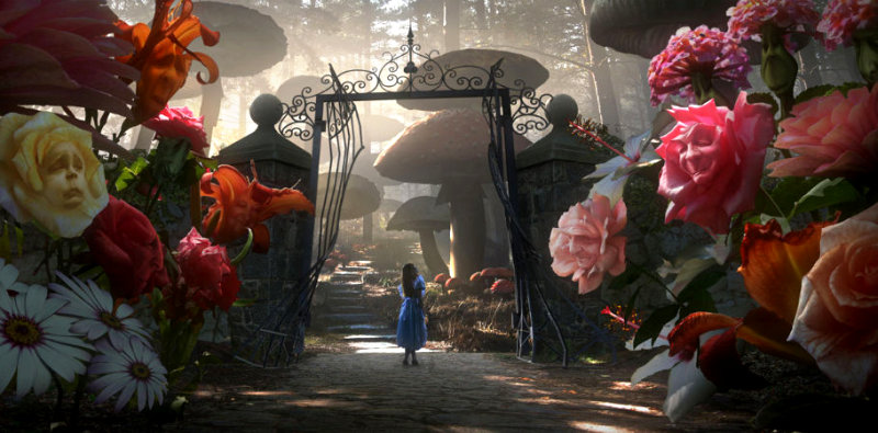
Where as Tim Burtons film, the latest of the Alice In Wonderland explorations, exploits the technology of the 21st century. Special effects, vivid colour, and 3D viewing to define aspects. 
Walt Disney Limited Editions - Alice in Wonderland - Alice in the Flowers


Bibliography


Delivery

The mediums we choose to publish our works define how we approach design. For example editorial publications have to consider the audience that use that specific brand of editorial,  where within the publication it needs to be placed, the tone of the message, ect.  However billboards or other forms of large scale advertising presents the challenge of size  and how the visual hierarchy of the design is going to be perceived at that size. 
The current advertisement for Skoda Fabia VRS uses a television advert as the main platform. This allows the company to access a wide audience and various points in the day. The advert is a product of their last car 'made of lovely stuff' of which a car is created using only food materials like cakes. This was clearly aimed at families, pretty, pleasant, friendly model of car.


However their latest is the offspring the rebellious teenager 'made of meaner stuff' The car is made from punches, biting, scraps, and snake venom. The soundtrack is the same but remixed to the metal genre. They've used the platform of their previous success to emphasise the target audience - metal - rebellion- youth market. An image alone would not have translated the message or the audience as well. Everything that can be used within film, i.e. music, effects, camera angles all help in communicating the design of the car. How we deliver the message affects how it is understood. 


Bibliography


Development of Idea's and Structure in Moving Image

Three Act Structure
"Every movie needs to have a beginning, a middle and an, end, but not necessarily in that order." - Jean Luc Goddard.
Every story has a 3 act structure. For example the film 'Knocked Up' directed by Judd Apatow

Act 1: The end of act 1 occurs when the protagonist of the story makes a commitment that leads into the rest of the story.

Introduced to the characters; Alison, who lives with her sister's family. The family setting, and her workplace. Also introduced to Ben, and his reckless lifestyle. The promotion - Alison gets promoted to an on camera position, which she celebrates with her sister Debbie. Whilst out she 'meets the pothead reckless Ben Stone.' Despite her sister leaving the evening early. Alison makes the commitment to stay out alone with Ben. This leads directly into the main action (no pun intended). Drinking and dancing until the two go home together and have a one night stand without a condom.

Act 2 concerns the state of equilibrium being disturbed, which triggers a sequence of events. At the end of this equilibrium is restored but different to the original state.

The awkward morning after, state of equilibrium is disturbed when during an celebrity interview, Alison experiences morning sickness. Allowing her to realise she's pregnant. After telling Ben and meeting with a gynaecologist, the decision is made to keep the baby. Various events then occur that illustrate Ben's bad parenting   skills, or the ability to look after anyone. Funny vegas shroom scenes. After which Alison concludes shes better off alone.


Act 3: Finally the main action becomes relevant to the inner story.The emotional impact on the characters. Within the 3rd act the protagonist grows emotionally, romantic or otherwise.

Due to the loss of the one person he truly cares about, Ben takes it upon himself to take responsibility and read various baby books. Once Alison goes into labour she calls Ben for help. Due to his emotional growth he is able to take control and handle the situation. Equilibrium is restored. 


Visual Information

When information is changed into design. This principle reminds me of kinetic typography. The text is explaining the fact of the situation, the story. Whilst the type of text visually describe the tone of the situation.  
This is a still from kinetic typography video of a scene from Pulp Fiction, having a general calm conversation. When a shot is accidentally fired, into the face of the another person. Hence how the background has suddenly turned red to depict blood shed, and the slight white splattering left, hints as to how the blood was shed. Yet the typography shows no sense of alarm, highlighting that the character has not yet realised what has occurred.

Reflective Visual Journal

Principle 1 - To draw and work by hand.
In order to physically engage the hand, eye, and brain, it is essential to work by hand. It helps us to observe, and recognise elements we may not have seen before, to actually see what is there, rather than what we think is there. Think visually. Henry Charles Beck's london underground could be described as a type of mind map, working out how best to display the aspects of the underground system.


"Henry Beck designed the first diagrammatic style tube map in 1933." Beck would take sections from maps to help him rework the system, as it was originally displayed by geographically placing the stops. 'This is a section from a map that was never issued.' It was found that geographic accuracy was not as important as how to get from one station to the other and how to change. 
Today's underground map. Uses colour to differentiate between service lines, and circles to show which lines intersect for changes. The design is clear and very legible which makes it accessible for a wide audience.

Principle 2- Utilise your brain
Working in Reflective visual journals, mind maps and use drawing to process thoughts. (the right side of the brain). Then by reflecting and organising your thoughts, you are using the left side of the brain. Clarifying and refining ideas, fully exploring a theme. 


David Carson's typography. First he has addressed the issue of tone of voice within typography with the statement 'Don't mistake legibility for communication.' Visual design should be representative of the message you are communicating. The word whisper in a bold font with capital letters is very legible, but doesn't communicate the meaning of the word. This piece  is in a legible type but make no sense when read left to right.  The right brain has playfully re-arranged the words to emphasise the point. But the left side of the brain has organised the words, logically determining the spacing between letters, and order of the words, in order to scramble the message but still be clear enough to understand. Left brain logically re-arranges the words into the correct order. 


Bibliography


http://www.20thcenturylondon.org.uk/server.php?show=conObject.2541 


http://www.google.co.uk/imgres?imgurl=http://www.knightsbridge.net/underground-map.gif&imgrefurl=http://www.knightsbridge.net/underground-map.html&usg=__bn_1Z7AfiKrBBqLCE6u9-7lCQUk=&h=792&w=1178&sz=213&hl=en&start=0&sig2=zaGLP6MZwoN76orHhsL3RQ&zoom=1&tbnid=TMe69osIxqG6mM:&tbnh=118&tbnw=176&ei=xqfhTL6XEYuOjAed36zJAQ&prev=/images%3Fq%3Dlondon%2Bunderground%2Bmap%26um%3D1%26hl%3Den%26sa%3DN%26biw%3D1643%26bih%3D903%26tbs%3Disch:1&um=1&itbs=1&iact=hc&vpx=669&vpy=125&dur=427&hovh=125&hovw=186&tx=123&ty=120&oei=kqfhTK_sG4KyhAf9-4jjDA&esq=4&page=1&ndsp=40&ved=1t:429,r:3,s:0


http://www.designjones.co.uk/tag/david-carson/