Search This Blog

Sunday, October 24, 2010

Key Principles of Graphic Design

Visual Hierarchy
This is the principle of how something is formatted, a piece of graphics is usually designed so you notice certain aspects first, each item has an order, a visual hierarchy. For example this web page for UK Vogue 

I noticed today's highlights section first, a video slideshow of the latest fashion news, second to this was the flashing 'Hogan' as campaign which not only features as to graphic videos on the page , but also forms the background. This clearly is of upmost importance to advertise this particular brand. It contrasts black , white, and colour imagery which is emphasised by flashes of light replicating the flash of a camera. Which connotes the glamour of the brand and therefore dominates the web design. Also the bold white typeface stands out against the dark tones of the imagery, again reinforcing its dominance, the emphasis is more on the brand itself than anything displayed in the background. 3rd in the hierarchy would be Vogue title, the familiar trusted typeface, or the 'Latest Features' section. The elements that come in last are the smaller stories 'breaking news' and Vogue's categories for the website (News, Spy, Fashion Shows).
The Vogue web page example shows various devices of making sure our attention is directed in a certain order, although today's highlights was my initial thought, the flash of the Hogan brand quickly diverted my attention elsewhere. The page is not cluttered it allows you to go through each aspect step by step, but does keep trying to re-direct you to the Hogan brand through repetition. (261)


Tone Of Voice
Typography has a tone of voice which can be translated over to what it is being used within or around. 'Chemical Burn' kinetic typography by Sebastian Jaramillo from the film fight club. Notice how the bold typeface that was once whole, has now been splintered and torn away as if the lettering is also getting a chemical burn. The red lettering taken out of context could be laughter, however due to the colour connotations and the shaping of the typeface, the tone set would be more of agony. The large green lettering has the voice of character 'Tyler Durden' he is dominant in control, the character to whom he is speaking to, 'The Narrator' has a smaller typeface as if whats he's saying does not matter it has no relevance, portraying the reality of the situation he is in. No control over the chemical burn. 


 As the motion graphic continues the lettering adjusts according to the tone of voice of the scene from Fight Club. As he tries to think of calm setting to take his mind of the pain, the tone of voice changes, the letters are black and small, simple serif typeface. Smaller than the rest of the imagery, less obvious, less urgent therefore a calmer tone. However the black still allows it to stand out. The graphics are shocking it is aimed to communicate exactly what is going on in the actual film without any imagery, you could watch and understand these graphics without the original context due to the tone of voice.
By changing the size, colour, and shape of typography we change the way it is interpreted, for example, WHISPER does not give the impression someone is whispering. 


Bibliography
http://www.vogue.co.uk/default.aspx?gclid=cowwq9mk0qqcfvhc4wodlvsvkg


http://www.sebastianjt.com/portfolio/project/fightclub

Key Principles of Illustration

The Role of the Audience
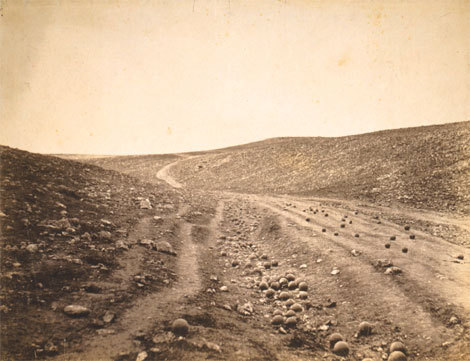
The work we create as artists has a purpose, it has a meaning and therefore it has an audience. By understanding the role of the audience we can focus the visual communication of the piece. The function and the meaning are affected by who the audience is. A piece of landscape photography could be aimed at anyone but if we research the location of the landscape we may discover that the area was the place of war. Such as Rodger Fenton's 'Valley of the Shadow of Death' However a landscape photograph could also be used in advertising such as for the Volvo XC90 by Darran Ree's, which advertises the car as being off-road, dependable. So by understanding the audience we can interpret the function more accurately. Audience is vital to visual communication they effect how work functions how works are developed and there content.


Final image


Notion of Inspiration
As artists it is important to analyse the target audience using primary and secondary research. Take interviews, questionnaires and find out how the audience would respond, what they enjoy, what they need ect. Also find out what has been done before, what worked, what doesn't. Research not only gives us a deeper understanding of how best to visually communicate, but it also inspires us.  The more we research the greater knowledge base we create, which leads to interesting pieces of work. For and idea to appear it has to come from somewhere we have to seek out pieces of information, images, words, objects. Anything and everything can help, the simplest thing can trigger a whole host of ideas, mind maps. One idea sprouts which forms another, which forms another ect. Research is vital to creation, " Inspiration exists, but it has to find us working." -Pablo Picasso.


Bibliography
http://jboultondesign.wordpress.com/

http://www.andrewgrahamdixon.com/archive/readArticle/442

http://www.thefstopmag.com/?p=386


Sunday, October 03, 2010

Key Principles of Integrating Theory And Practise

To understand a piece of art work we have to be able to acknowledge it's lineage. The form and content are usually very similar to an earlier concept. The only difference is that this piece is recontextualised and therefore appears to be new and original due to a slight difference, such as the medium. By transferring the mise en scene of a painting into a photograph we can recontextualise something and still provide the work with a sense of validity.  Also by taking an earlier concept and adding or replacing aspects with modern politics, history or icons we can recontextualise ideas. As this allows the relative audience to be able to relate and recognise a composition, and then they can therefore attempt to make sense of its meaning from their knowledge of contemporary events.

However without understanding where something has come from we cannot ascertain its meaning. For example the painting "Royal Family - Maids of Honour" by "Diego Velazquez" and "Pablo Picasso's" "Maids of Honour". The contemporary take of Velasquez's 17th century painting, both pieces have the same title which therefore draws attention to its lineage.
But the concept of originality is today hugely criticised, we are constantly told plagarism is illegal and wrong, we have to come up with our own ideas. However Picasso was not criticised for plagiarism, but praised for a hugely contemporary clever idea, as he was paying homage to Velasquez and therefore not stealing.

What is the difference then between plagiarism and paying homage to, is it merely accepting the fact that the concept has lineage. But if you choose to ignore that fact than surely it can be called original? Every idea is likely to have been done before, making it harder and harder for artists to be original.
'David Hurn' created a piece called 'Toys on a Fence', he had gone to a rubbish tip and found a collection of stuffed animals. Things that have been discarded, what's been left behind, traces of human existence. Artist 'Zoe Leonard' created something very similar "Mouth Open, Teeth Showing" a collection of toy dolls, some limbless all stood up positioned to look as if walking toward you like a toy army. Leonard's concept was also to show the objects we leave behind. Idea's in this day and age take much more prominence depending on the issue of the moment, (global warming/ consumerism, two very current issues) leading many artists to focus on the same thing. So could the notions of originality all be to do with 'Who had the idea first?'