During 15th century Europe, the production of books was inefficient and expensive, each book was individually scribed and this took months, as well as preparing sheepskin for parchment.
without paper typogrpahy would not have been possible. By 1276 papermaking had travelled from china to europe , the first paper mill establishes in fabriano, Italy.
Relief printing was the first form of production. Both illustrations and type had to be cut into the same block of wood. It was not possible to create detailed images of lengthy texts from the wood. Due to the possiblity of mass produced paper it became necessary for a more efficient form of printing. Laurens Janszoon Coster manufactured type by carving single letters onto blocks of wood. However The first book in Europe to ever be printed was the Bible by Johannes Gutenberg on September 30th, 1452 using metal movable type.
This invention extends far beyond religion, it is a landmark in time of print production. The Bible highly resembles manuscript due to the marginal spacing, the majority of the pages have 42 lines and has thus produced the nickname of the 42-line Bible. "For a typeface Gutenberg selected the popular textura lettering style"(ref 1), each letter was engraved on metal. The metal had to be soft enough to mould and yet hard enough to be durable consequently the metal was part lead, part tin, and part antimony. Typography revolutionised modern book printing, and the "development of art, science and religion through text."(ref 2) For example the distribution of the bible would allow people to make their own judgements of religion without having to trust the word of a religious figure. It would also help to distribute human rights.

A shot of the Gutenberg Bible


Movable Metal Type
Books
Cees W.de Jong., Alston W. Purvis., eds., 2010, Type: A Visual History of Typefaces and Graphics Styles 1901-1938, Volume 2, China, Taschen
The Experts
Who is your favourite expert ?
"Everything is made -Bob and Roberta Smith"
To be honest to select one expert to be my favourite would be extremely difficult, as every artist has something unique about their work that makes them brilliant. Also to say that my favourite expert is a graphic artist would probably be a lie. Many designers I think are amazing but it's not often I find myself inspired to create work. In my opinion you gain more inspiration from fine artists or any other art specification, as they are producing something completely different and you can take it, transform it, spin it on its head, but it will never be the same as its not from the same practise. To produce a piece of work from other designers could very possibly produce another piece of work thats very similar and who wants to do create something already made. However I will explain why Bob and Roberta Smith, and Mike Nelson are two of my favourite artists.
BOB AND ROBERTA SMITH
Bob and Roberta Smith create large personalised signs, some of which are similar to something you would expect to see as a status update on social network sites; "Buy me a nice scarf" or "I like Miami". Smith creates works that are almost political but with an edge of humour. He challenges pre-concieved ideas, and the rigidity of education you are made to trust. Smith believes its far better to be absurd, daring. He questions the norm and then pushes it further, using subversive humour to humiliate the constricts of society and authority.
Bob and Roberta Smith create large personalised signs, some of which are similar to something you would expect to see as a status update on social network sites; "Buy me a nice scarf" or "I like Miami". Smith creates works that are almost political but with an edge of humour. He challenges pre-concieved ideas, and the rigidity of education you are made to trust. Smith believes its far better to be absurd, daring. He questions the norm and then pushes it further, using subversive humour to humiliate the constricts of society and authority.
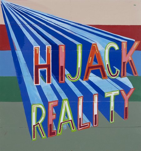
I love this sign, it sums up his style, humorous, controversial, and imaginative. These signs seize your attention, the use of bold colours and three dimensional type, as if the words are about to spring off the page. They literally hijack you from reality, allowing you to forget your surroundings, and be momentarily amused. The use of the word hijack generally associated with tales of war, terrorism and other horribly depressing things, but instead used in conjunction with your imagination. Instead commanding our attention instructing us to go do something absurd, unordinary, anything as long as its not what would be expected in the dull reality of society.
MIKE NELSON

Mike Nelson however is a completely different artist, he is a british contemporary installation artist. I recently saw his work "The Coral Reef" at the Tate in London. Originally built in 1999 and first shown at Matts Gallery London in January 2000. Almost exactly 10 years later shown at the Tate. "The name refers to the oceans surface a prevalent ideology, like one of capitalism. Under the oceans surface lies the coral reef - a complex and fragile structure in which different belief systems exist."

The installation is built as a labyrinth, each room within the exhibition demonstrates its own unique ideology, its own atmosphere. However the labyrinth illustrates a dystopia, a series of fragile societies characterised by human misery and oppression. They are the coral reef, beautiful and interesting each entirely unique, but aren't acknowledged, they can't be seen.

The purpose of the labyrinth portrays this point further as you wander the installation you become lost, a room leads to another room, which leads to another room thats similar. One of the first rooms you enter is later replicated as the last room, making you believe you have gone back on yourself, a guard is ready to escort you out at any moment. I saw this is as very metaphorical, we are lost in these ideologies, they are very prevalent in our lives yet we refuse to accept them but Mike Nelson forces us to become lost within them.


Bibliography
Brazier, Paul. ed, Wiedemann Julius. ed, 2010, Everything Is Made, London, D&AD, Taschen
http://www.halesgallery.com/artists/_BOB%20AND%20ROBERTA%20SMITH/
http://channel.tate.org.uk/media/207494480001
The Tate Modern
No comments:
Post a Comment