Search This Blog

Sunday, December 26, 2010

Relaxing Your Habitual Thinking Pattern

Approaching problems with conventional education, rationality & experience, rigidity, and inhibitions.

Solving a problem, or thinking of a way to communicate something can be restricting, and personally can often leave me stuck with artist block, or in a design rut. The same old tired solutions pop up. But why is this? Is it the rigidity of the school education system forcing us to think more logically and not creatively? Or are we just too scared to put our ideas out there for fear of rejection? Something new and different may not be liked, where as the old and familiar are safe fallbacks.
I was recently asked to design a graphic logo for a website promoting a book, and business. The logo had to communicate the fundamental function for the site, which was basically advice for building work. Building Design Expert. Nothing sprang to mind from this, I had a complete mind blank. My first thought was a geek in a hard hat, (Geek = Expert) stereotype, the old and familiar.
However I allowed myself to free think, I decided to list any ideas that came to mind, no matter how stupid, or silly. This led to a train of thoughts that sprang off one another, providing me with a wide range of ideas on which I can further develop. I googled key words, and looked up definitions, and from the first though that came to mind I noted and expanded upon, and then what idea came from that, ect ect.
By not restricting myself to ideas that would not be mocked or thought of as juvenile, I was able to free my habitual thinking, and approach the graphic with a different mindset. The rigidity of stereotypes fell to the back of my mind. By approaching problems conventionally, we cannot create an original solution.


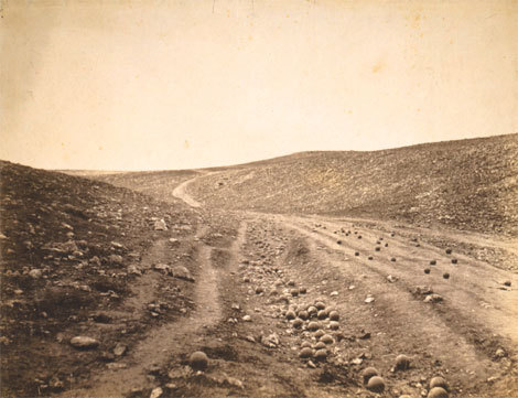
Escher is a perfect example of what can be achieved when your imagination runs wild. Creating worlds of dreams, optical illusions that boggle the mind but also make you believe in something more. So many layers and levels to one image.

Bibliography

http://escherdroste.math.leidenuniv.nl/images/scan450.jpg

Managing A Creative Environment

Our ideation is greatly influenced by our surroundings; a dull workspace makes for predictable results. Where as a workspace cluttered with imagination and creations inspires us to think beyond the norm what is or could be possible.
I don’t have a set workspace, there isn’t a set studio at university, I predominately work from my bedroom, here I have access to art books, a collection of magazines, past artworks, past research, and the Internet. These are the core things that form my creative space. Everything I have found to be of educational use, or of general interest I tend to horde, as it could come in handy at any point. I fear the moment I discard them, I will need it to explore a design problem.
Bright colours, wide open spaces, and objects or works you find of interest can always help in sparking ideation processes. What we collect reflects our personal interests and thus our personal way of working
“Landfill Editions is an independent publisher based in London releasing Comics, Zines, Prints, Short Fiction and Science-Fact since winter 2009.”
It’s studio I found through the creative review website. The video talks about theire studio space and working within a team. Their creative environment is maintained by surrounding themselves with their work and work they find inspiring. Also because it is an open space “where lots of people are involved it emphasises the exciting bits about art school, all the discussion. Talking to people that do something similar but not the same. Share books, work together, A real sense of community.


Bibliography 

Wednesday, December 01, 2010

Sony Blu Ray Lasers

Behind the photograph


Can A Photograph Really Capture whats inside? 


When you look a photograph, what do you see? What's really there? Unless you were physically involved in the process of the image can you tell? Annie Leibovitz was doing a shoot with Johnny Depp in a hotel room in New York in 1994, when his then current girlfriend Kate Moss was asked if she would pose with Johnny. The image portrays the true love of a high status couple 
I think it's true that a lot of photos true meaning is hidden, or the message is mis-interpreted. It's difficult to convey true emotion as photographs are often staged. However I feel when a photograph is candid, or at least candid in a similar sense to Leibovitz's, true emotion can be conveyed. This photograph to me captures a beautiful moment of serenity, and love. 
On the other hand you could say that it is pretty easy to remark upon the emotion when the context is known. As, if it was unknown the two were a couple at the time, perhaps this real emotion would not have been communicated. Knowing the context, history, or story have some grounding in the truth relating to the image will immediately change how we respond to and interpret what we are seeing, what is 'supposed' to be deciphered, rather than what is actually attained.


Sam Taylor Wood's series Crying Men - male celebrities all pictured in a deep state of emotion provokes the question is this real or is it orchestrated? These are people who have their photo taken every single day, wether it be paparazzi or a shoot, it is anothers days work; faking emotion. 
The images still provoke an emotional reaction despite there being the barrier of whether its real or not. Actors seen crying outside the realm of Hollywood, outside of the Hollywood context breaks down the barrier of film and reality. Someone of such status still experiencing human emotion. 
None of the men in the series however are pulling a face, grimacing like you see your neighbour, or best friend do if they were upset. So does this suggest then that the images are false, that as actors they are told to cry on command and thats merely all thats shown in the photograph? In which case the emotion provoked from Wood's photographs are the same we experience in a film, it feels real to us as we become involved with the atmosphere, but the camera does not show all the lighting, staging, and the time it's taken to get the right shot. 
Documentary photography however is different, the famous image of Kim Phuc by Nick Ut running naked down the streets of Trang Bang, Vietnam captures the raw fear and distress of the village at that time. It did not take hours to get a shot, there is no lighting rigs, or script, completely in the moment, nothing but a distressing reality is involved.


How can text help convey meaning or emotion?


As i said earlier understanding the context of an image will automatically change your interpretation. So by adding copy write, does this change it again, provide a fresh outlook or add to what we already know?

(The text reads: "In 12 minutes, a napalm bomb will unexpectedly explode 400 feet from here. Children will run in despair; one entirely naked, screaming in fear and pain. The soldier will do nothing, while a photographer captures this moment, forever immortalising it. Great Photos come without a brief.")


I think this image is amazing unbeknownst to me whether the photo was taken 12 minutes before the explosion, it still triggers thought into how an image known all over the world was taken by chance. A journalist or photographer in the area, a tourist exploring vietnam? Sheer luck or did Nick Ut have some inkling as to what was going on with this area? Either way the copy-write that covers this image really adds to the raw emotion of the original. You start to picture this little girl running towards you "screaming in fear and pain" It has been "forever immortalised." No-one will ever forget Kim Phuc. Nick Ut unveiled the horror of war to people ignorant of its reality, and this copy-writed image emphasises and conveys the unimaginable pain, putting history into perspective as if we were there.


Bibliography

(In order of appearance)


3)When The Stars Weep, Nochlin.L, Steidl, 2004


Monday, November 15, 2010

Production & Outcomes, Influences & Reactions

Interpretation
Alice in Wonderland created by Lewis Carroll in 1865 has been re-interpreted many times over. 'Sir John Tenniel' was the first to illustrate this story. The drawing is representative of the Victorian era in which it was created. Dark and scary characters, the mise en scene is appropriate to the time also.


Artists emphasise the meaning of their work by using contemporary issues that surround their creation. Zeitgeist - "The spirit of the time; the taste and outlook characteristic of a period or generation." For example the interpretation of this classic story is drastically altered by 1951 when Disney produced their version. Very colourful, joyful, childlike artwork. The 50s was a post war period, after so many tragedies spirits needed to be lifted, to raise the moral of the country. Disney provided light hearted entertainment of what was a dark, twisted story. The main villain - The Queen of Hearts is not even frightening. The target audience for this variation is families, allowing child and parent enjoy something together.
Where as Tim Burtons film, the latest of the Alice In Wonderland explorations, exploits the technology of the 21st century. Special effects, vivid colour, and 3D viewing to define aspects. 
Walt Disney Limited Editions - Alice in Wonderland - Alice in the Flowers


Bibliography


Delivery

The mediums we choose to publish our works define how we approach design. For example editorial publications have to consider the audience that use that specific brand of editorial,  where within the publication it needs to be placed, the tone of the message, ect.  However billboards or other forms of large scale advertising presents the challenge of size  and how the visual hierarchy of the design is going to be perceived at that size. 
The current advertisement for Skoda Fabia VRS uses a television advert as the main platform. This allows the company to access a wide audience and various points in the day. The advert is a product of their last car 'made of lovely stuff' of which a car is created using only food materials like cakes. This was clearly aimed at families, pretty, pleasant, friendly model of car.


However their latest is the offspring the rebellious teenager 'made of meaner stuff' The car is made from punches, biting, scraps, and snake venom. The soundtrack is the same but remixed to the metal genre. They've used the platform of their previous success to emphasise the target audience - metal - rebellion- youth market. An image alone would not have translated the message or the audience as well. Everything that can be used within film, i.e. music, effects, camera angles all help in communicating the design of the car. How we deliver the message affects how it is understood. 


Bibliography


Development of Idea's and Structure in Moving Image

Three Act Structure
"Every movie needs to have a beginning, a middle and an, end, but not necessarily in that order." - Jean Luc Goddard.
Every story has a 3 act structure. For example the film 'Knocked Up' directed by Judd Apatow

Act 1: The end of act 1 occurs when the protagonist of the story makes a commitment that leads into the rest of the story.

Introduced to the characters; Alison, who lives with her sister's family. The family setting, and her workplace. Also introduced to Ben, and his reckless lifestyle. The promotion - Alison gets promoted to an on camera position, which she celebrates with her sister Debbie. Whilst out she 'meets the pothead reckless Ben Stone.' Despite her sister leaving the evening early. Alison makes the commitment to stay out alone with Ben. This leads directly into the main action (no pun intended). Drinking and dancing until the two go home together and have a one night stand without a condom.

Act 2 concerns the state of equilibrium being disturbed, which triggers a sequence of events. At the end of this equilibrium is restored but different to the original state.

The awkward morning after, state of equilibrium is disturbed when during an celebrity interview, Alison experiences morning sickness. Allowing her to realise she's pregnant. After telling Ben and meeting with a gynaecologist, the decision is made to keep the baby. Various events then occur that illustrate Ben's bad parenting   skills, or the ability to look after anyone. Funny vegas shroom scenes. After which Alison concludes shes better off alone.


Act 3: Finally the main action becomes relevant to the inner story.The emotional impact on the characters. Within the 3rd act the protagonist grows emotionally, romantic or otherwise.

Due to the loss of the one person he truly cares about, Ben takes it upon himself to take responsibility and read various baby books. Once Alison goes into labour she calls Ben for help. Due to his emotional growth he is able to take control and handle the situation. Equilibrium is restored. 


Visual Information

When information is changed into design. This principle reminds me of kinetic typography. The text is explaining the fact of the situation, the story. Whilst the type of text visually describe the tone of the situation.  
This is a still from kinetic typography video of a scene from Pulp Fiction, having a general calm conversation. When a shot is accidentally fired, into the face of the another person. Hence how the background has suddenly turned red to depict blood shed, and the slight white splattering left, hints as to how the blood was shed. Yet the typography shows no sense of alarm, highlighting that the character has not yet realised what has occurred.

Reflective Visual Journal

Principle 1 - To draw and work by hand.
In order to physically engage the hand, eye, and brain, it is essential to work by hand. It helps us to observe, and recognise elements we may not have seen before, to actually see what is there, rather than what we think is there. Think visually. Henry Charles Beck's london underground could be described as a type of mind map, working out how best to display the aspects of the underground system.


"Henry Beck designed the first diagrammatic style tube map in 1933." Beck would take sections from maps to help him rework the system, as it was originally displayed by geographically placing the stops. 'This is a section from a map that was never issued.' It was found that geographic accuracy was not as important as how to get from one station to the other and how to change. 
Today's underground map. Uses colour to differentiate between service lines, and circles to show which lines intersect for changes. The design is clear and very legible which makes it accessible for a wide audience.

Principle 2- Utilise your brain
Working in Reflective visual journals, mind maps and use drawing to process thoughts. (the right side of the brain). Then by reflecting and organising your thoughts, you are using the left side of the brain. Clarifying and refining ideas, fully exploring a theme. 


David Carson's typography. First he has addressed the issue of tone of voice within typography with the statement 'Don't mistake legibility for communication.' Visual design should be representative of the message you are communicating. The word whisper in a bold font with capital letters is very legible, but doesn't communicate the meaning of the word. This piece  is in a legible type but make no sense when read left to right.  The right brain has playfully re-arranged the words to emphasise the point. But the left side of the brain has organised the words, logically determining the spacing between letters, and order of the words, in order to scramble the message but still be clear enough to understand. Left brain logically re-arranges the words into the correct order. 


Bibliography


http://www.20thcenturylondon.org.uk/server.php?show=conObject.2541 


http://www.google.co.uk/imgres?imgurl=http://www.knightsbridge.net/underground-map.gif&imgrefurl=http://www.knightsbridge.net/underground-map.html&usg=__bn_1Z7AfiKrBBqLCE6u9-7lCQUk=&h=792&w=1178&sz=213&hl=en&start=0&sig2=zaGLP6MZwoN76orHhsL3RQ&zoom=1&tbnid=TMe69osIxqG6mM:&tbnh=118&tbnw=176&ei=xqfhTL6XEYuOjAed36zJAQ&prev=/images%3Fq%3Dlondon%2Bunderground%2Bmap%26um%3D1%26hl%3Den%26sa%3DN%26biw%3D1643%26bih%3D903%26tbs%3Disch:1&um=1&itbs=1&iact=hc&vpx=669&vpy=125&dur=427&hovh=125&hovw=186&tx=123&ty=120&oei=kqfhTK_sG4KyhAf9-4jjDA&esq=4&page=1&ndsp=40&ved=1t:429,r:3,s:0


http://www.designjones.co.uk/tag/david-carson/

Sunday, October 24, 2010

Key Principles of Graphic Design

Visual Hierarchy
This is the principle of how something is formatted, a piece of graphics is usually designed so you notice certain aspects first, each item has an order, a visual hierarchy. For example this web page for UK Vogue 

I noticed today's highlights section first, a video slideshow of the latest fashion news, second to this was the flashing 'Hogan' as campaign which not only features as to graphic videos on the page , but also forms the background. This clearly is of upmost importance to advertise this particular brand. It contrasts black , white, and colour imagery which is emphasised by flashes of light replicating the flash of a camera. Which connotes the glamour of the brand and therefore dominates the web design. Also the bold white typeface stands out against the dark tones of the imagery, again reinforcing its dominance, the emphasis is more on the brand itself than anything displayed in the background. 3rd in the hierarchy would be Vogue title, the familiar trusted typeface, or the 'Latest Features' section. The elements that come in last are the smaller stories 'breaking news' and Vogue's categories for the website (News, Spy, Fashion Shows).
The Vogue web page example shows various devices of making sure our attention is directed in a certain order, although today's highlights was my initial thought, the flash of the Hogan brand quickly diverted my attention elsewhere. The page is not cluttered it allows you to go through each aspect step by step, but does keep trying to re-direct you to the Hogan brand through repetition. (261)


Tone Of Voice
Typography has a tone of voice which can be translated over to what it is being used within or around. 'Chemical Burn' kinetic typography by Sebastian Jaramillo from the film fight club. Notice how the bold typeface that was once whole, has now been splintered and torn away as if the lettering is also getting a chemical burn. The red lettering taken out of context could be laughter, however due to the colour connotations and the shaping of the typeface, the tone set would be more of agony. The large green lettering has the voice of character 'Tyler Durden' he is dominant in control, the character to whom he is speaking to, 'The Narrator' has a smaller typeface as if whats he's saying does not matter it has no relevance, portraying the reality of the situation he is in. No control over the chemical burn. 


 As the motion graphic continues the lettering adjusts according to the tone of voice of the scene from Fight Club. As he tries to think of calm setting to take his mind of the pain, the tone of voice changes, the letters are black and small, simple serif typeface. Smaller than the rest of the imagery, less obvious, less urgent therefore a calmer tone. However the black still allows it to stand out. The graphics are shocking it is aimed to communicate exactly what is going on in the actual film without any imagery, you could watch and understand these graphics without the original context due to the tone of voice.
By changing the size, colour, and shape of typography we change the way it is interpreted, for example, WHISPER does not give the impression someone is whispering. 


Bibliography
http://www.vogue.co.uk/default.aspx?gclid=cowwq9mk0qqcfvhc4wodlvsvkg


http://www.sebastianjt.com/portfolio/project/fightclub

Key Principles of Illustration

The Role of the Audience
The work we create as artists has a purpose, it has a meaning and therefore it has an audience. By understanding the role of the audience we can focus the visual communication of the piece. The function and the meaning are affected by who the audience is. A piece of landscape photography could be aimed at anyone but if we research the location of the landscape we may discover that the area was the place of war. Such as Rodger Fenton's 'Valley of the Shadow of Death' However a landscape photograph could also be used in advertising such as for the Volvo XC90 by Darran Ree's, which advertises the car as being off-road, dependable. So by understanding the audience we can interpret the function more accurately. Audience is vital to visual communication they effect how work functions how works are developed and there content.


Final image


Notion of Inspiration
As artists it is important to analyse the target audience using primary and secondary research. Take interviews, questionnaires and find out how the audience would respond, what they enjoy, what they need ect. Also find out what has been done before, what worked, what doesn't. Research not only gives us a deeper understanding of how best to visually communicate, but it also inspires us.  The more we research the greater knowledge base we create, which leads to interesting pieces of work. For and idea to appear it has to come from somewhere we have to seek out pieces of information, images, words, objects. Anything and everything can help, the simplest thing can trigger a whole host of ideas, mind maps. One idea sprouts which forms another, which forms another ect. Research is vital to creation, " Inspiration exists, but it has to find us working." -Pablo Picasso.


Bibliography
http://jboultondesign.wordpress.com/

http://www.andrewgrahamdixon.com/archive/readArticle/442

http://www.thefstopmag.com/?p=386


Sunday, October 03, 2010

Key Principles of Integrating Theory And Practise

To understand a piece of art work we have to be able to acknowledge it's lineage. The form and content are usually very similar to an earlier concept. The only difference is that this piece is recontextualised and therefore appears to be new and original due to a slight difference, such as the medium. By transferring the mise en scene of a painting into a photograph we can recontextualise something and still provide the work with a sense of validity.  Also by taking an earlier concept and adding or replacing aspects with modern politics, history or icons we can recontextualise ideas. As this allows the relative audience to be able to relate and recognise a composition, and then they can therefore attempt to make sense of its meaning from their knowledge of contemporary events.

However without understanding where something has come from we cannot ascertain its meaning. For example the painting "Royal Family - Maids of Honour" by "Diego Velazquez" and "Pablo Picasso's" "Maids of Honour". The contemporary take of Velasquez's 17th century painting, both pieces have the same title which therefore draws attention to its lineage.
But the concept of originality is today hugely criticised, we are constantly told plagarism is illegal and wrong, we have to come up with our own ideas. However Picasso was not criticised for plagiarism, but praised for a hugely contemporary clever idea, as he was paying homage to Velasquez and therefore not stealing.

What is the difference then between plagiarism and paying homage to, is it merely accepting the fact that the concept has lineage. But if you choose to ignore that fact than surely it can be called original? Every idea is likely to have been done before, making it harder and harder for artists to be original.
'David Hurn' created a piece called 'Toys on a Fence', he had gone to a rubbish tip and found a collection of stuffed animals. Things that have been discarded, what's been left behind, traces of human existence. Artist 'Zoe Leonard' created something very similar "Mouth Open, Teeth Showing" a collection of toy dolls, some limbless all stood up positioned to look as if walking toward you like a toy army. Leonard's concept was also to show the objects we leave behind. Idea's in this day and age take much more prominence depending on the issue of the moment, (global warming/ consumerism, two very current issues) leading many artists to focus on the same thing. So could the notions of originality all be to do with 'Who had the idea first?'